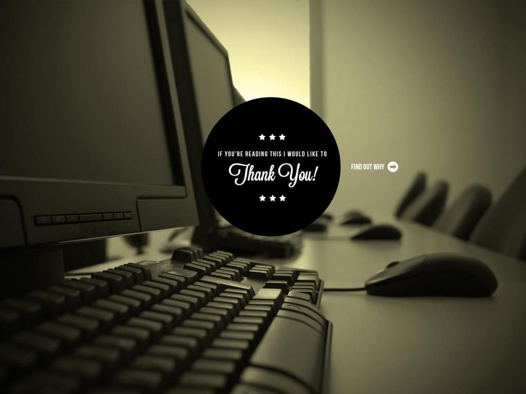
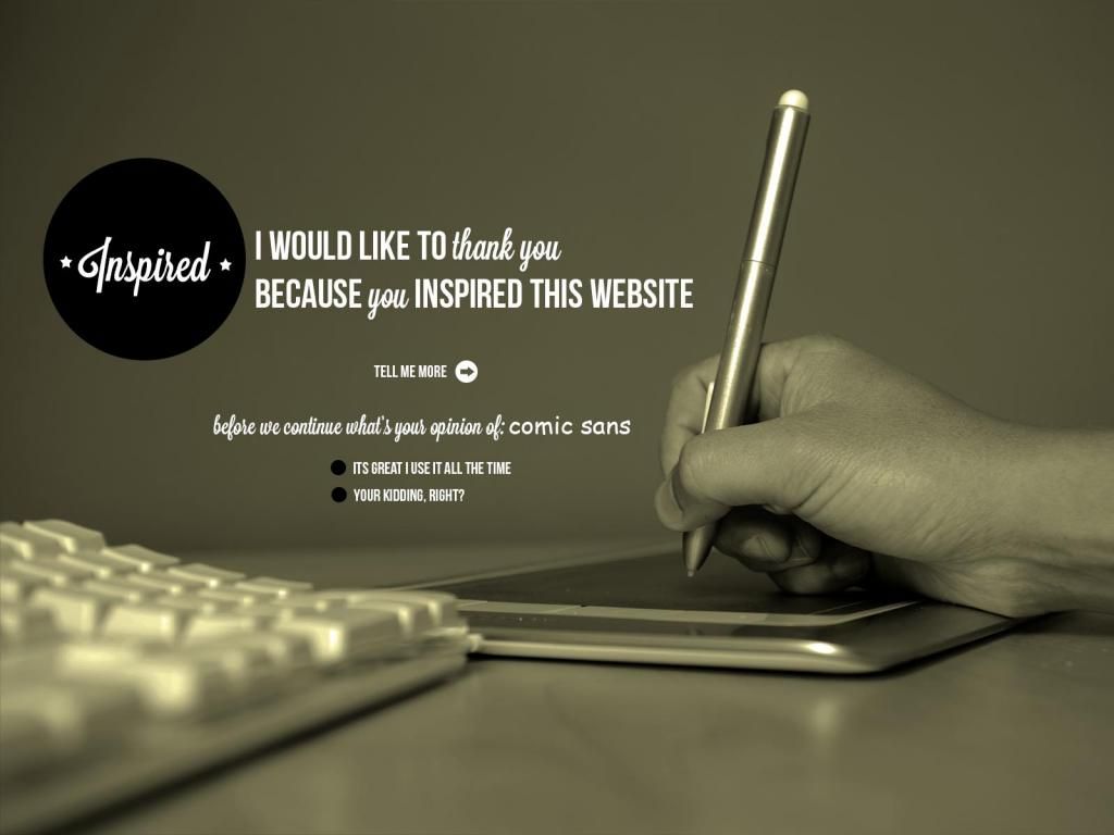
Still pretty rough. Trying to figure out how these will look at different resolutions. I think I will end up coloring the backgrounds different and losing the images for mobile resolutions
I kind of like the "green" and haha on your choice of "person" thingy thing.
Brie Porterfield
- Time isn’t a straight line. It’s all… bumpy-wumpy. There’s loads of boring stuff. Like Sundays and Tuesdays and Thursday afternoons. But now and then there are Saturdays. Big temporal tipping points when anything’s impossible.
I like your concept. The colors and typography are working well. Instead of making the background solid you should just crop the images differently to fit on the specific resolution. Just a thought. Nice work.
Looks pretty cool. Will totally live or die by the photography though. I would like to see different images that represent each page. I feel like keeping the same image for even two pages will confuse users. I also hate the block of text that is all caps. No real reason to ever do that in my book, at least for a full paragraph. If you like that look i would recommend using a font that is all caps but the lowercase caps are a bit smaller than the caps caps. That would help...sorta. IMO just make it sentence case and call it good.