Page 1 of 2
Prelim project 2
Posted: Fri Oct 06, 2023 10:42 pm
by Osmar_Sandoval
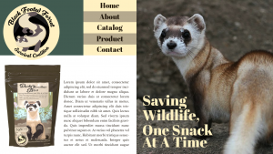
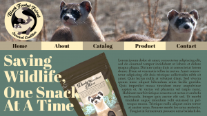
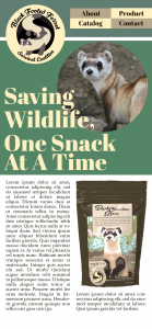
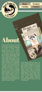
Hope everyone is doing well after the Final and Prelim Combo due today. Here for my project two prelim, I had two different companies for my two different layouts to give more variety in what I could do this project. The first idea was a company that protects the endangered species of Black-Footed Ferrets, and raises money through products like special dark chocolate bites. I used a quick 3D render of one for reference in this rough. The first page is the home page and the second is an about page with a closer look at the render. The colors here are very natural and earthy to fit with the habitat of the Black-Footed Ferrets. The logo features a ferret with a swirly font that matches the energy of all ferrets and helps give the whole thing a more fun and inviting look.


This second design is for a snowboarding company that focuses on selling quality snowboards that can be used by anyone, such as beginners or professionals. This design is simpler than the ferret one but all the elements here still tie up naturally using the white and blue as a sort of snow themed color scheme. The logo features a cool blue bunny with snowboarding glasses and a jacket hoodie outline as if the bunny is ready to board down a mountain. I like both of these designs for their color palettes and simple looks, simple but also easy and fun to look at.
Let me know which one you all think is better!
Re: Prelim project 2
Posted: Sun Oct 08, 2023 1:06 pm
by Cole_Richarrds
Hi Osmar, I really like both of your ideas, I like you using previous designs, I think personally I would go for the snowboard concept, I might be just saying that because I snowboard but I also really like the concepts, the colors are nice and its easy to understand. I would maybe change the font for the navigation on that one, I find it is a bit too condensed. Well done! Can't wait to see it finished!
Re: Prelim project 2
Posted: Mon Oct 09, 2023 10:01 am
by bmeyer
Hi Osmar!
I think both designs are cool but I really like the snowboarding design. I think the colors look great together and the overall design feels cohesive. I also really like the imagery on the home page and how it fades in. I think it would be good to also add the logo to the home page because it is a really cool logo.
Re: Prelim project 2
Posted: Wed Oct 11, 2023 10:42 pm
by isaacm03
Hi Osmar!
These are such lovely layouts! I love the vintage look paired with the modern-looking serif font, that contrast leads to some interesting visuals. I think I am leaning more towards your first layout because it just feels so much fun. As for what I would change, maybe some gradient maps would help tie images in better! Great work!
Re: Prelim project 2
Posted: Thu Oct 12, 2023 2:38 pm
by YoAdrian!
Hi Osmar,
Oh man, how am I supposed to choose? I love the ferret idea, but the bunny logo is too great to pass up...so many good projects from that! It's really up to you, and you can't go wrong with either idea. Right off the bat, I think the snowboard layout is cleaner and easier to conceptualize. If you went with that one, I might push your blue color scheme a little more. I like the blues, but they feel a little safe. Maybe a retro feel? Neons? Anyways, something to explore.
Re: Prelim project 2
Posted: Fri Oct 13, 2023 2:34 pm
by bdawg11
Hey Osmar,
I would like to see the second layout be your website. Not only is the logo cool, but you used your own snowboard design as one of the options.
Re: Prelim project 2
Posted: Fri Oct 13, 2023 8:37 pm
by Cj9497
Excellent page layout of your designs. This one I honestly can't choose I like em both. Great job, can't wait to see what you decide on going with.
Re: Prelim project 2
Posted: Fri Oct 13, 2023 10:43 pm
by mckenzie
Hey Osmar. I love the first design and your use of color, the mobile version especially catches my attention. Your hierarchies and use of space are eye-catching.
Re: Prelim project 2
Posted: Sat Oct 14, 2023 1:31 pm
by Christopher B
Hi Osmar,
I love the concept with the animal CTA - it means so much more to be purchasing with a purpose.
Potential concept: change your CTA phrase in the large font to a color that isn't analogous with your color scheme. Right now, the beige font kind of blends in like camouflage - consider a complementary or adjacent color for this. If you do keep the beige colors, consider adding a glow effect (text-shadow: 0 0 5px #f504e9;)
Re: Prelim project 2
Posted: Wed Oct 25, 2023 1:08 pm
by Instructor
Osmar, the Ferret and the Snowboard are both fun. I like the Ferret better but I think snowboard would make more money if you launched it for real. Your logos are impressive, as well as the candy bag.