
Project 1 Roughs
Project 1 Roughs
Here are my rough layouts. Please feel free to enjoy a laugh or bash it. Thanks for looking!
- Attachments
-
- Rough 2 Interior Page
-
- Rough 2 - Home Page
-
- Rough 1 - Interior Page
-
- Rough 1 - Home page
-
Marco horta

- Posts: 44
- Joined: Tue Jan 23, 2018 6:45 pm
Re: Project 1 Roughs
hello, I like what I see. The selection of colors and gradients combinations are pretty good, my favorite one is your first design. it is well balanced between images and the menu bar also I like what you have done on your logo. keep up your good work.
Marco Horta
“Life is like riding a bicycle. To keep your balance, you must keep moving.” —Albert Einstein
“Life is like riding a bicycle. To keep your balance, you must keep moving.” —Albert Einstein

Re: Project 1 Roughs
Hello,
I agree with Marco, I thing your rough one has a well-balanced layout that will convey information effectively. I like how your header and navigation work together as a frame to allow the products to stand out. I would just change the titles of your product sections (ex: hunting Gear) to match the style in you navigation and logo.
I agree with Marco, I thing your rough one has a well-balanced layout that will convey information effectively. I like how your header and navigation work together as a frame to allow the products to stand out. I would just change the titles of your product sections (ex: hunting Gear) to match the style in you navigation and logo.
Stephanie Kendziorski.
Re: Project 1 Roughs
This is an awesome store!
I agree with what has been said so far. The first rough's nav on the left side is more legible then that of the first. I think you could push the color choice of the nav type though, maybe all black instead of white?Good job!
I agree with what has been said so far. The first rough's nav on the left side is more legible then that of the first. I think you could push the color choice of the nav type though, maybe all black instead of white?Good job!
Cheers,
Hannah Selvey
Hannah Selvey
-
Instructor

- Site Admin
- Posts: 387
- Joined: Tue Jan 03, 2012 9:50 am
- Location: Reno, Nevada
- Contact:
Re: Project 1 Roughs
LOL!  Such a great concept. The logo, the name, the cartoons. It just tickles me.
You have a super strong brand here. It's bleeding out all over the place. I love the wacky cartoony feel of the whole thing. I prefer your first design, because it gives your more space to work with, without compromising your strong brand. I also like the implied eagle wings in the top bar. The colors serve to reinforce your branding, of course. Then again you really couldn't go with any other color scheme for something like this, now could you? Your typographic choices in the logo and navigation are working well. The font is an in your face sans-serif that announces it's intentions and doesn't have any of that frou-frou serif stuff on it. Your navigation is easy to see and use. You also have a large area in which to lay out your pages; almost three quarters of the screen.
It just need a couple of things, I feel. One, it needs more contrast. Yes you have plenty of colors, but the gradients are washing them out a little bit. I think instead of gradiating to white, maybe have them gradiate from a darker version of the color to a lighter version of the color might enhance the boldness of the composition a little more. Maybe even use some black (or white) in your top bar. Two, your page content below the navigation bar is a little spread out and fragmented. Each object is kind of on an island. I'd recommend tightening the label text a little bit with each category image and them making sure each of the category items is equally spaced apart. I don't think you need to underline the label text either.
Fun times!
If we feel useful in life and loved, it sure makes life significant and wonderful
Toni McDonough - GRC 275 Instructor
tmcdonough@tmcc.edu | 775-583-5262
Toni McDonough - GRC 275 Instructor
tmcdonough@tmcc.edu | 775-583-5262
-
HouseStark

- Posts: 47
- Joined: Thu Jan 25, 2018 9:46 am
Re: Project 1 Roughs
I like rough 1 and I like the nav bar on the left easy to navigate and read. Main body of the page seems a little fragmented - spread out to much. I think you can have some fun with this site. For some reason I thought of the characters in the movie "Tremors" the couple that has all the weapons, I could see them shopping here.
Michele Keast Ott
“Even the smallest person can change the course of the future.” – Galadriel, Lord of the Rings
“Even the smallest person can change the course of the future.” – Galadriel, Lord of the Rings
-
Eduardo_Garcia
- Posts: 58
- Joined: Tue Jan 23, 2018 6:51 pm
Re: Project 1 Roughs
Hi,
both designs are great! I'd go with rough 1
The color scheme and gradient really make the design dynamic, is more compact and patriotic!
both designs are great! I'd go with rough 1
The color scheme and gradient really make the design dynamic, is more compact and patriotic!
Re: Project 1 Roughs
I really like the second layout's design. The colors are awesome and have a very 'Merica feel. Instead of an outline on your text try using drop shadows to give the page more depth. Nice work and I can't wait to see your final product!
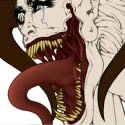
Sarah Alvarado - Graphic Designer, Illustrator, and Monster Enthusiast
“...to all the monsters in my nursery: May you never leave me alone.”
― Guillermo del Toro, The Strain
“...to all the monsters in my nursery: May you never leave me alone.”
― Guillermo del Toro, The Strain
-
Cassie_Bowers
- Posts: 44
- Joined: Thu Jan 25, 2018 6:59 pm
Re: Project 1 Roughs
I like your first design best. I like the logo you designed and the way you did the nav bar. I don't think you need to underlines on the text below the pictures.
Cassandra Bowers
-
BecomeAHero
- Posts: 26
- Joined: Mon Sep 19, 2016 5:49 pm
Re: Project 1 Roughs
I like the easy navigation design in rough one. I think it draws more attention to your logo as well. The only thing I would worry about is contrast. So far everything is really light and in the same range as far as shade, maybe break out some bolder darker color for contrast or add some shadows?
Written, read, and approved by:
Tara Rinehart
Tara Rinehart