

For this project, I will be building an online store for a Research and Development firm called Onyx.
Basically the name is inspired by the term "Black Budget", which refers to high-funded and secretive projects that push the boundaries of reality. The dark scheme is to reflect exactly that. I was aiming for a blacked-out brand identity. I really like the concept for the branding. But as always let me know your thoughts.
I think I have a very strong branding concept, however, I still need to refine the layout a bit more.
Here are some of the layouts that I have.
PS: I don't know if make the navigation part of the overall menu or to use a drawer menu.
Project 1 Roughs by FJBO
Project 1 Roughs by FJBO
- Attachments
-
- Product Page
-
- Second homepage layout possibility.
-
- First homepage layout possibility.
-
-
FJBO
FRANCISCO JAVIER BECERRA-ORTIZ
FRANCISCO JAVIER BECERRA-ORTIZ
Re: Project 1 Roughs by FJBO
Duder, I love your branding concept, the all black theme works well throughout your layouts. Although, I think a hamburger menu might work best here.
I particularly like homepage 1 and your product page. They both are super clean and I like the descriptive photos on each page.
You might try to incorporate some of those white boxes into your homepage to give the website a more unified look.
Great work !
I particularly like homepage 1 and your product page. They both are super clean and I like the descriptive photos on each page.
You might try to incorporate some of those white boxes into your homepage to give the website a more unified look.
Great work !
Cheers,
Hannah Selvey
Hannah Selvey

Re: Project 1 Roughs by FJBO
Francisco,
Your designs look so modern, mostly homepage-1 and product-page. I assume you will be implementing cool effects for your homepage. Have you thought about making the images of your products move as the user hovers over them? I think this is a great project, with a beautiful branding. Good job!
Your designs look so modern, mostly homepage-1 and product-page. I assume you will be implementing cool effects for your homepage. Have you thought about making the images of your products move as the user hovers over them? I think this is a great project, with a beautiful branding. Good job!
Stephanie Kendziorski.
-
HouseStark

- Posts: 47
- Joined: Thu Jan 25, 2018 9:46 am
Re: Project 1 Roughs by FJBO
Nice and clean website with a cool look to it. My first choice is homepage 1 and like the product page. The color of the text/nav and title get a little lost in the background color. My thoughts are darken the background a little more but would not do black since I feel that would be to much. Or pull out a color (blue maybe) out of the image and use that for the color of your text - tie it together to create a visual flow.
I have a thing for airplanes and really like the image in login-screen.
Very nice work.
I have a thing for airplanes and really like the image in login-screen.
Very nice work.
Michele Keast Ott
“Even the smallest person can change the course of the future.” – Galadriel, Lord of the Rings
“Even the smallest person can change the course of the future.” – Galadriel, Lord of the Rings
-
Instructor

- Site Admin
- Posts: 387
- Joined: Tue Jan 03, 2012 9:50 am
- Location: Reno, Nevada
- Contact:
Re: Project 1 Roughs by FJBO
Interesting aesthetic choices here, Francisco. The full page F-35 image login is a standout. Of your home pages, I like your homepage-1 design the best. It's a clean design that matter-of-factly presents it's information as you would expect form a super high-end engineering firm like this one. You use textures and shadows particularly well to add dimensionality and visual interest to your layout. The pictures do a good job of illustrating both what this company does and what it sells. You have great margins between objects. The distances are perfect to establish grouping. Your navigation is easy to find and use and is well places, as is your cart button.
Unfortunately the dimensionality seems to vanish with your live type. Your navigation has none of the shadows and textures that the rest of the layout has and it's a bit glaring. I'd recommend adding at least a shadow to your navigation and bolding your "Cart" text. I'm also not sold on the type choices on the inner page. The bodycopy seems too bold. I'd recommend a good ol' sans-serif type like Myriad or Helvetica.
A good start!
If we feel useful in life and loved, it sure makes life significant and wonderful
Toni McDonough - GRC 275 Instructor
tmcdonough@tmcc.edu | 775-583-5262
Toni McDonough - GRC 275 Instructor
tmcdonough@tmcc.edu | 775-583-5262
-
Eduardo_Garcia
- Posts: 58
- Joined: Tue Jan 23, 2018 6:51 pm
Re: Project 1 Roughs by FJBO
Hello,
great designs, my choice would be your homepage 1, clean and orderly!
Advice would be change brighten nav and header text, as it fades to the background due to being similar in color to background
great designs, my choice would be your homepage 1, clean and orderly!
Advice would be change brighten nav and header text, as it fades to the background due to being similar in color to background
Re: Project 1 Roughs by FJBO
Hi Francisco, wow! Your designs are EPIC! Definitely go with homepage 2. It has a super cool display-esque design that captures your models perfectly. Awesome job and I can't wait to see your final product!
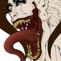
Sarah Alvarado - Graphic Designer, Illustrator, and Monster Enthusiast
“...to all the monsters in my nursery: May you never leave me alone.”
― Guillermo del Toro, The Strain
“...to all the monsters in my nursery: May you never leave me alone.”
― Guillermo del Toro, The Strain
-
Cassie_Bowers
- Posts: 44
- Joined: Thu Jan 25, 2018 6:59 pm
Re: Project 1 Roughs by FJBO
I like your "homepage-1" layout. The black and grey are nice and work well with the theme. I like how you made your products look 3D with the boxes under them. Maybe make the logo a little lighter so it stands out more.
Cassandra Bowers
-
chaytothet

- Posts: 27
- Joined: Tue Jan 23, 2018 6:34 pm
Re: Project 1 Roughs by FJBO
I love both of these! I love the black and white, but it might do with a bit of a pop of color..? Maybe a royal, navy blue?
Looks good though!
Looks good though!
-
BecomeAHero
- Posts: 26
- Joined: Mon Sep 19, 2016 5:49 pm
Re: Project 1 Roughs by FJBO
Love the image login screen! I prefer your first layout, because I like what you're doing with shadows and highlights, I think this has a stronger navigation too, rather than the blocks in the second layout design. If you want to add in a highlight color anywhere, I think that blue in your image really pops off against the grey. The only thing I would add is maybe a light texture into the background, maybe something metallic, or mesh. You did really well with contrast, considering your website is almost entirely monotone. Its a really cool way to challenge yourself.
Written, read, and approved by:
Tara Rinehart
Tara Rinehart