

Hi all,
Here are my two layouts. I chose to sell doughnuts paired with unusual things like wine beer and coffee (coffees not so weird but I needed a third beverage). I hope you all enjoy!
Project 1 ~ Roughs
Project 1 ~ Roughs
- Attachments
-
-
-
-
"A day without laughter is a day wasted." - Charlie Chaplin
Brianna Mick
Brianna Mick

Re: Project 1 ~ Roughs
I enjoyed your second design more:
Your layout is very well done, the minimalist/hipster feeling is very on this. There is a few things that definitely need some work like colors: the color palette that you chose for your first design I feel works best, readability is almost very difficult try enclosing your text with a solid background or increasing color contrast between text and images.
Your layout is very well done, the minimalist/hipster feeling is very on this. There is a few things that definitely need some work like colors: the color palette that you chose for your first design I feel works best, readability is almost very difficult try enclosing your text with a solid background or increasing color contrast between text and images.
FJBO
FRANCISCO JAVIER BECERRA-ORTIZ
FRANCISCO JAVIER BECERRA-ORTIZ
-
HouseStark

- Posts: 47
- Joined: Thu Jan 25, 2018 9:46 am
Re: Project 1 ~ Roughs
I like your design 2 which would be the one I would go with. The one thing that I would fix is the contrast between text and background.
Michele Keast Ott
“Even the smallest person can change the course of the future.” – Galadriel, Lord of the Rings
“Even the smallest person can change the course of the future.” – Galadriel, Lord of the Rings

Re: Project 1 ~ Roughs
Hi!
I like your first design, It immediately made me hungry when I saw it. I love the background image (wood floor) and the coffee beans. Perhaps instead of a white layer on top you could play with a darker color and have the opacity as low as possible to make the details of the wood stand out. You could remove the white background on the images (page_01) to make it match your homepage. The text on that page gets a little lost because of the coffee beans background, you could easily fix that with a dark layer on top too. I think this is a great website, I love the typeface you chose to work with!
I like your first design, It immediately made me hungry when I saw it. I love the background image (wood floor) and the coffee beans. Perhaps instead of a white layer on top you could play with a darker color and have the opacity as low as possible to make the details of the wood stand out. You could remove the white background on the images (page_01) to make it match your homepage. The text on that page gets a little lost because of the coffee beans background, you could easily fix that with a dark layer on top too. I think this is a great website, I love the typeface you chose to work with!
Stephanie Kendziorski.
Re: Project 1 ~ Roughs
elloz!
I like your second layout more than the first. I like the background image on the inner page because it adds depth overall layout. The homepage is clean and is easy to navigate through as well. I might try some transparent boxes around the body copy of the inner layout, may separate the copy from the background a bit more. Great work!
I like your second layout more than the first. I like the background image on the inner page because it adds depth overall layout. The homepage is clean and is easy to navigate through as well. I might try some transparent boxes around the body copy of the inner layout, may separate the copy from the background a bit more. Great work!
Cheers,
Hannah Selvey
Hannah Selvey
-
Instructor

- Site Admin
- Posts: 387
- Joined: Tue Jan 03, 2012 9:50 am
- Location: Reno, Nevada
- Contact:
Re: Project 1 ~ Roughs
Time to play another round of mix and match. Nice!
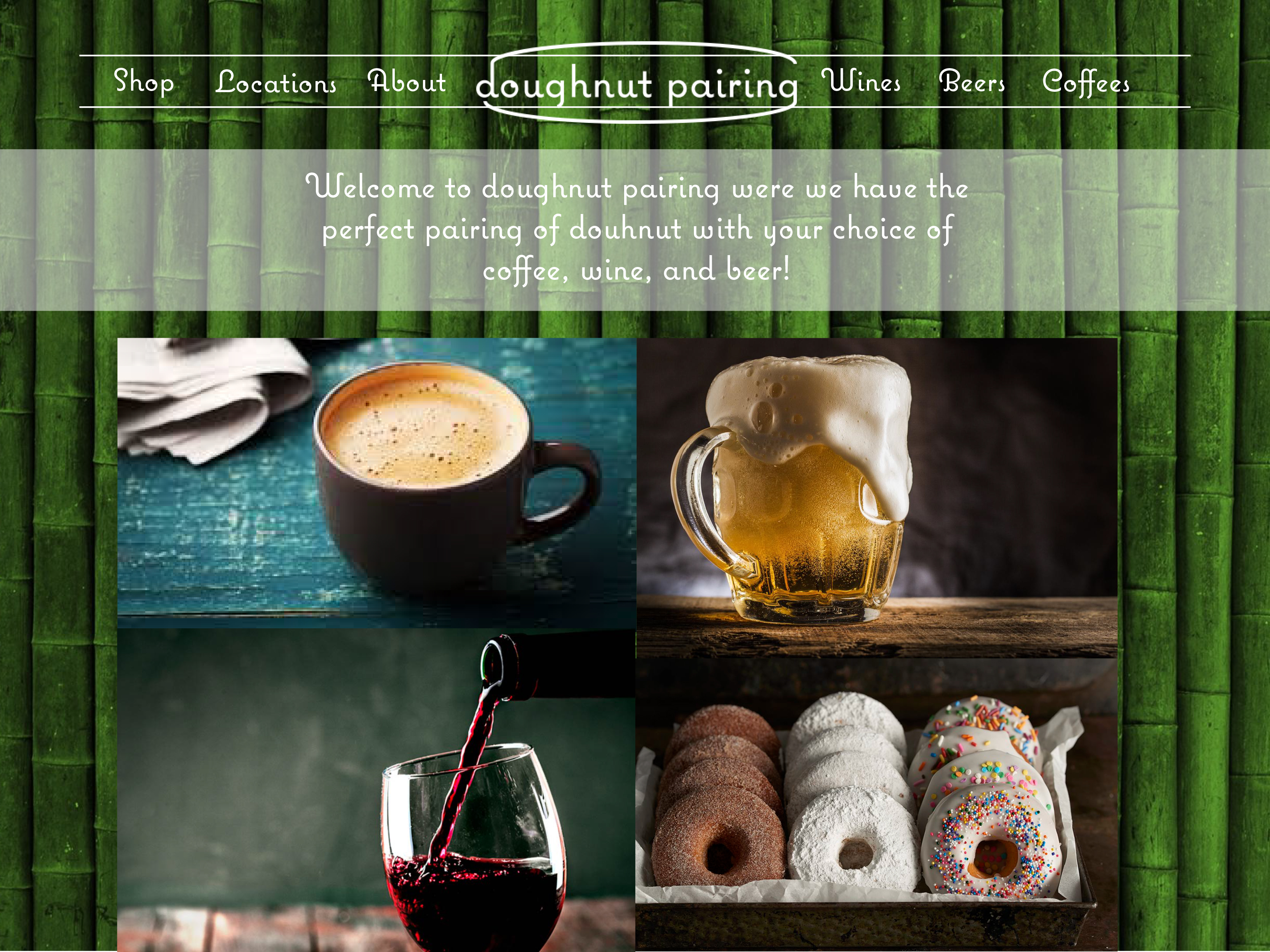
I like the layout of your second home page. The navigation placement, the four images, the mission statement, and the interrelationships between all three. The only thing that doesn't really work on it is the bamboo background. That's where your first home page comes in. I think it's wood background would look great underneath your second home page. You do have a pretty strong brand though. It makes me think hipster coffee shop or one of those gastropubs where they serve your food on a wooden slab. Your navigation is well placed and easy to use. I quite like your typography choice as well. It reinforces your brand and gives the whole thing an artisanal feel.
I think your second inner page is working pretty decently. I like your category separations and how easy it is to find. Your navigation shift works well too. It's in the same spot, but more focussed. Watch your margins though. It gets a little tight around your page title and a little loose around your categories. I'm not sold on the illustrations of wine glasses either, I think it'd look better if you went a little more pictorial. Make sure your inner pages all have a very similar layout if you are going to have different background images. That way the layout and common nav location can tie the whole thing together.
A great start!
If we feel useful in life and loved, it sure makes life significant and wonderful
Toni McDonough - GRC 275 Instructor
tmcdonough@tmcc.edu | 775-583-5262
Toni McDonough - GRC 275 Instructor
tmcdonough@tmcc.edu | 775-583-5262
Re: Project 1 ~ Roughs
I like the look of the first of the two. The menu is easy to read and navigate and muted background image of the wood grain completely immerses you in the site while giving you a large area to work in and place different elements of your choosing. The font choice works well for the business and using black for the text makes it easy to read and lets the images stand out while not being boring or falling into the background. My only suggestions would be to continue those features on the second page by dimming the background image and making the text black. Also, you may want to consider adding in some space between "Next", "Back", "Top" and "Bottom" and space them out evenly across the top. The site looks like a great start for what is to come!
-
BecomeAHero
- Posts: 26
- Joined: Mon Sep 19, 2016 5:49 pm
Re: Project 1 ~ Roughs
Hello!
I really enjoy the typeface you've chosen. I think would go over nicely with the target audience for your shop! I personally like your second layout more, and I enjoy the photos you've chosen, but I think I would steal the photographic cut outs from your first home page for the shop page in your second design instead! The illustrations would be really cute, but I think the photos would mesh better with your home page.
I really enjoy the typeface you've chosen. I think would go over nicely with the target audience for your shop! I personally like your second layout more, and I enjoy the photos you've chosen, but I think I would steal the photographic cut outs from your first home page for the shop page in your second design instead! The illustrations would be really cute, but I think the photos would mesh better with your home page.
Written, read, and approved by:
Tara Rinehart
Tara Rinehart
Re: Project 1 ~ Roughs
Hi Brianna, I am really like your first design. It has a very quaint minimalist feel, combined with your enticing imagery and playful text placement. I would suggest choosing a clean sans serif font for your descriptions as it would be easier for the view to read. Great job and I can't wait to see your finished product!
Sarah Alvarado - Graphic Designer, Illustrator, and Monster Enthusiast
“...to all the monsters in my nursery: May you never leave me alone.”
― Guillermo del Toro, The Strain
“...to all the monsters in my nursery: May you never leave me alone.”
― Guillermo del Toro, The Strain
-
Cassie_Bowers
- Posts: 44
- Joined: Thu Jan 25, 2018 6:59 pm
Re: Project 1 ~ Roughs
I like your second design best. The green background is really nice and the font you chose is really cool! Maybe make the pictures a little smaller in the inner page so they aren't too close together.
Cassandra Bowers