
Project 1 roughs
-
Cassie_Bowers
- Posts: 44
- Joined: Thu Jan 25, 2018 6:59 pm
Project 1 roughs
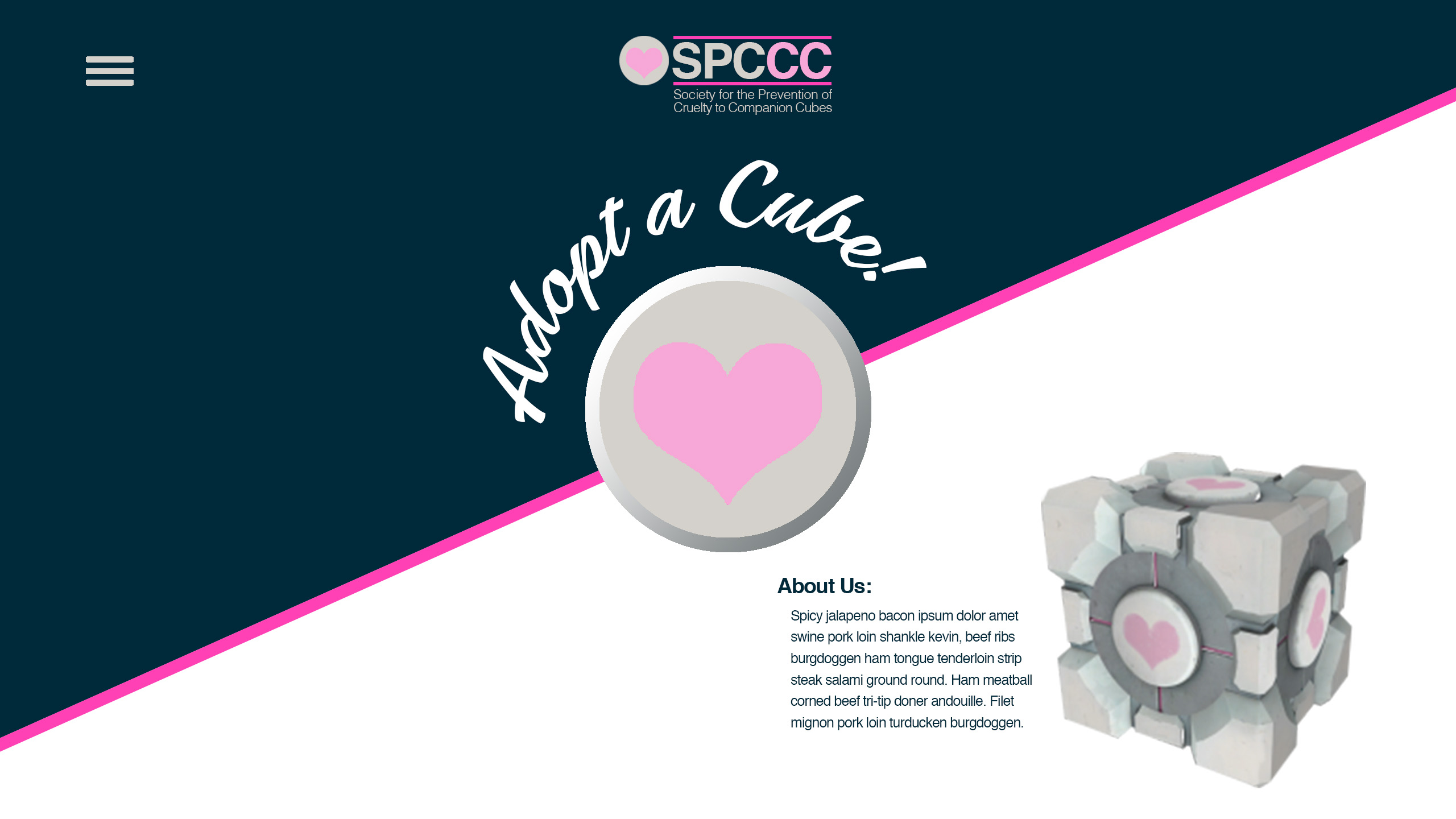
I chose to sell Companion Cubes. Companion Cube is a character in the video game "Portal". For my website I'm going for a scammy pet adoption organization vibe. The website will look like a non-profit that's trying to help Companion Cubes but really it will be a shop selling Companion Cubes and Companion Cube themed products for the money. I hope to incorporate the sarcasm and morbid sense of humor the game has. I didn't have as much time as I would have liked to flesh out these roughs so they are a bit simple for what I usually do. I want to continue from last semester and try parallax scrolling again and I hope to incorporate some cool jQuery effects.
- Attachments
-
-
-
-
Cassandra Bowers

Re: Project 1 roughs
Very Nice!
I love the style of this design:
The high-contrast is awesome, the modern edgy feeling is all in. Typographic details is like cherry on top. Playing around with different layouts was very very good, but does not look like a store. I am not saying is a bad style, I think your current distribution would work better for a website that is more about content than selling.
Again, very nice!
FJBO
FRANCISCO JAVIER BECERRA-ORTIZ
FRANCISCO JAVIER BECERRA-ORTIZ
-
chaytothet

- Posts: 27
- Joined: Tue Jan 23, 2018 6:34 pm
Re: Project 1 roughs
I love this concept!! I loved this game!!
I really like the high contrast that was mentioned in the comment before, but I like the fading in the other, Can you maybe incorporate them into each other? They are all very striking.
Awesome job!
I really like the high contrast that was mentioned in the comment before, but I like the fading in the other, Can you maybe incorporate them into each other? They are all very striking.
Awesome job!
-
HouseStark

- Posts: 47
- Joined: Thu Jan 25, 2018 9:46 am
Re: Project 1 roughs
This is hard since I like both. I am leaning towards design 2 but like the product layout on the inner page from design 1. The staggered layout of the product makes the focus on what you are selling. Good Job!
Michele Keast Ott
“Even the smallest person can change the course of the future.” – Galadriel, Lord of the Rings
“Even the smallest person can change the course of the future.” – Galadriel, Lord of the Rings

Re: Project 1 roughs
Hello!
I agree with Francisco, your first design is modern. That pink bar across the screen makes your design appear dynamic. I think it will work perfectly with the parallax scrolling effect that you mentioned. I would perhaps keep that pink bar throughout the design. You could vary the orientation and guide the viewer throughout your website as they scroll down.
I agree with Francisco, your first design is modern. That pink bar across the screen makes your design appear dynamic. I think it will work perfectly with the parallax scrolling effect that you mentioned. I would perhaps keep that pink bar throughout the design. You could vary the orientation and guide the viewer throughout your website as they scroll down.
Stephanie Kendziorski.
Re: Project 1 roughs
I like both too, but I'm leaning to the first "modern" design a little bit more. The light pink and dark blueish colors really compliment each other. I'm also an a fan of the diagonal pink stripe through the homepage.
For your headline on the inner page, I would bring the type forward, so it overlaps the pink stroke. Nice work!
For your headline on the inner page, I would bring the type forward, so it overlaps the pink stroke. Nice work!
Cheers,
Hannah Selvey
Hannah Selvey
-
Instructor

- Site Admin
- Posts: 387
- Joined: Tue Jan 03, 2012 9:50 am
- Location: Reno, Nevada
- Contact:
Re: Project 1 roughs
Companion Cubes! Awesome!
I'm terrified at the product possibilities.
I like your vaporwave second design the best. I think I might be losing my contrast touch here. This is the second straight critique where I prefer the less contrasty design over the more. I am disturbed. I especially like the faded companion cube elements on your home page. It does a good job of moving the eye inward, toward your content. That parody SPCA logo cracks me up. It works well to establish what the purpose of the website is, while staying on brand with the companion cube. Your overall layout has good spacing. Everything has room to breate without fragmenting. Typographically, it's quite good as well. Your headlines in particular are excellent. The handwriting font and pink brush stroke work well to capture a retro feel that goes well with the subject of the website. Your hamburger navigation is easy to find. We'll see how it looks once it's clicked on. Your inner page is super clean as well. Possibly better than your home page. I like the use of companion cube elements as a framing device and the margins are spot on.
Watch your leading on your home page paragraphs. It's super tight and stands out against your otherwise good margins. I'd recommend justifying your type, too. This is a website that sells cubes after all, so you want to have as much blockiness as possible.
Well done!
If we feel useful in life and loved, it sure makes life significant and wonderful
Toni McDonough - GRC 275 Instructor
tmcdonough@tmcc.edu | 775-583-5262
Toni McDonough - GRC 275 Instructor
tmcdonough@tmcc.edu | 775-583-5262
-
Eduardo_Garcia
- Posts: 58
- Joined: Tue Jan 23, 2018 6:51 pm
Re: Project 1 roughs
Hi,
Love both of your designs, hard to choose between the two, but I'd go with your second design!
The color scheme, logo, and font choice really pop!
Advice is to have the Nav(Three horizontal lines) be in the same corner, rather than switching it to a different corner.
Love both of your designs, hard to choose between the two, but I'd go with your second design!
The color scheme, logo, and font choice really pop!
Advice is to have the Nav(Three horizontal lines) be in the same corner, rather than switching it to a different corner.
Re: Project 1 roughs
Hi Cassandra, I am really liking your second design. The palette your chose has a great contrast and gives off a modern feel. The fade you have on your imagery is very appealing too! The only thing I would suggest is making your text a bit bigger. Great job and I can't wait to see your finished product!
Sarah Alvarado - Graphic Designer, Illustrator, and Monster Enthusiast
“...to all the monsters in my nursery: May you never leave me alone.”
― Guillermo del Toro, The Strain
“...to all the monsters in my nursery: May you never leave me alone.”
― Guillermo del Toro, The Strain
-
BecomeAHero
- Posts: 26
- Joined: Mon Sep 19, 2016 5:49 pm
Re: Project 1 roughs
I have to go with your first design for the home page. The bold color and geometric layout are very attention grabbing, and the heart of the companion cube as the focal point of your home page is a really nice touch. It looks like something that will be a really fun fluid design as well, and you have plenty of space to play with in terms of sizing down the website for a phone or tablet.
I do prefer the second design's shopping page layout, however. If you were to frankenstein the two shopping pages together, with the light background from the first shopping page rough, and the solid companion cube replacing the faded one in the top, I think it'd be pretty perfect, but honestly both designs are really strong. I can't wait to see your finished website!
I do prefer the second design's shopping page layout, however. If you were to frankenstein the two shopping pages together, with the light background from the first shopping page rough, and the solid companion cube replacing the faded one in the top, I think it'd be pretty perfect, but honestly both designs are really strong. I can't wait to see your finished website!
Written, read, and approved by:
Tara Rinehart
Tara Rinehart