
project1_roughs
-
rmiyashiro
- Posts: 37
- Joined: Tue Aug 30, 2016 10:03 pm
project1_roughs
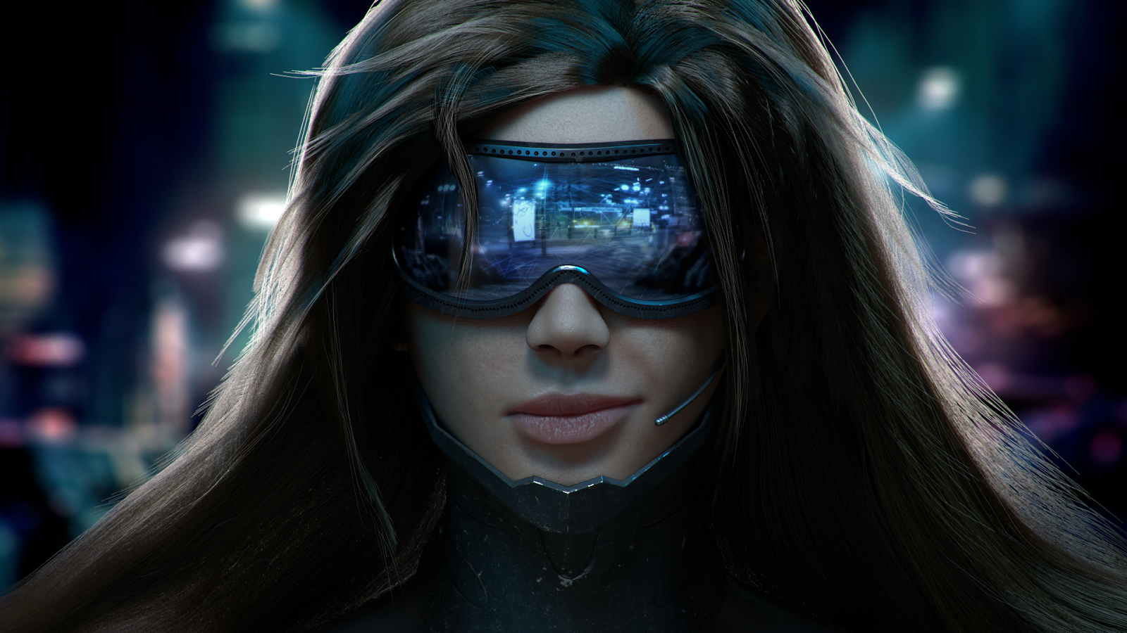
Hey y'all, here are my designs. This project was soooo open that I spent all my time daydreaming and fiddling around with a logo and looking for imagery that I forgot about layout. I'm not too happy with either layout nor the logo. The first one is supposed to look futuristic but just ends up looking bare.
I tried to model these after a plastic surgeons site or a doctors office site by using neutral(ish?) colors and a script font with the logo.
Ryan 'Danger' Miyashiro
Re: project1_roughs
Ryan,
Forgive me in advance if I miss the concept, but it's about cyborgs, yes? I even looked up the meaning and I dig the concept of your site. I like the font and color scheme of the first design because it does give a hint of futuristic. However, I like the second design based on the overlapping nav bar over the photo. Maybe blend two design elements together? On the second design - pink doesn't really scream futuristic. The best thing about using black in your color scheme, all bright pastel colors work great. Throw in some cyan or green into the mix. Me personally, when I think futuristic, I think of motherboard patterns. Maybe use elements of that? The logo doesn't feel as futurey, I see the potential for your logo looking like a target. Targets are hard to design - might end up looking like a sniper target. But I'd still play around with it. Use more straight lines? Curves usually remind me of circle of life vibe. Overall, I think you got a hit here, I can't wait to see more!
Forgive me in advance if I miss the concept, but it's about cyborgs, yes? I even looked up the meaning and I dig the concept of your site. I like the font and color scheme of the first design because it does give a hint of futuristic. However, I like the second design based on the overlapping nav bar over the photo. Maybe blend two design elements together? On the second design - pink doesn't really scream futuristic. The best thing about using black in your color scheme, all bright pastel colors work great. Throw in some cyan or green into the mix. Me personally, when I think futuristic, I think of motherboard patterns. Maybe use elements of that? The logo doesn't feel as futurey, I see the potential for your logo looking like a target. Targets are hard to design - might end up looking like a sniper target. But I'd still play around with it. Use more straight lines? Curves usually remind me of circle of life vibe. Overall, I think you got a hit here, I can't wait to see more!
"Tell me, I'll forget. Show me, I might remember. Involve me, and I'll understand" – quote from some smart asian guy
Rosa Rodriguez
Rosa Rodriguez
Re: project1_roughs
We discussed this in class, so you already know that I like your first design best. The Home page is dramatic, eye-catching (pun intended...lol) and feels more cyborgy than the second design. Your logo rocks...I just realized that it represents not only the company name, but the 'center of the world' from your story.
The style of the inner page matches the Home page quite well, but it needs that same splash of color, or a ribbon of color, that we see on the Home page. We talked about that, too. If you need more help with that...just ask!
Happy Designing,
Denise
The style of the inner page matches the Home page quite well, but it needs that same splash of color, or a ribbon of color, that we see on the Home page. We talked about that, too. If you need more help with that...just ask!
Happy Designing,
Denise
Denise Norwood
-
BecomeAHero
- Posts: 26
- Joined: Mon Sep 19, 2016 5:49 pm
Re: project1_roughs
Very nice!
The second design looks calming and refreshing, more like what a medical company would try to put forth as their image, which I think is a good way to go for a cybernetic product, especially with something that would be as scary as going under the knife for.
The first design though, is edgier, but plain. The image is fantastic, but I think bringing in some textures would add to the futuristic and high-tech feel if you choose this one.
Written, read, and approved by:
Tara Rinehart
Tara Rinehart
-
Joe_Morales

- Posts: 28
- Joined: Mon Aug 29, 2016 6:42 pm
Re: project1_roughs
Ryan,
This seems like a fun concept I like the technology feel you can make with this. I'd recommend omphalos cybernetic systems utilize a cool color scheme and maybe schematics in the background or something scientific to give the site that extra futuristic feel. I like the layout of the second design more and if you can mess with the color scheme and imagery a bit this could be great! excited to see what you come up with!.
Joe M.
Joe Morales
-
Instructor

- Site Admin
- Posts: 387
- Joined: Tue Jan 03, 2012 9:50 am
- Location: Reno, Nevada
- Contact:
Re: project1_roughs
Omphalos is a great name for what you're selling. Navel gazing indeed.
You know, usually I'm a contrast whore about these things, but I actually like the second design better. I like that it's trying to be a nice, soft, health clinic website while concealing the horror of what it's really about. Like Rosa's organ selling website. It reminds me of some of the websites they built for viral marketing of the various Deus Ex games. I like the flesh colored background. It's establishes that something a little unsettling is happening here. I like the logo, it's so anodyne and falsely warm. The semi-transparent navigation bar establishes a modern feel while the warm serif and script types help give a soft, false comfort feel. It's also easy to find and use. The whole layout is very clean and easy to follow. It's passing it's information on to potential customers with a minimum of fuss.
I'd add in a few more pictures of some happy cyborgs (have fun in Photoshop). Take a look at some "legitimate" health clinic sites for inspiration. The inner page in particular could use some more pictures.
Good stuff!
If we feel useful in life and loved, it sure makes life significant and wonderful
Toni McDonough - GRC 275 Instructor
tmcdonough@tmcc.edu | 775-583-5262
Toni McDonough - GRC 275 Instructor
tmcdonough@tmcc.edu | 775-583-5262
-
kaycee_weddell
- Posts: 39
- Joined: Mon Aug 29, 2016 6:42 pm
Re: project1_roughs
Good job so far. Your concept is interesting and i like the look and feel of the roughs so far. Your logo turned out well. I think that I am leaning more towards your second design. The colors work nicely together and they bring out your logo.
Kaycee Weddell
-
ravennvrmre
- Posts: 23
- Joined: Mon Aug 29, 2016 6:42 pm
Re: project1_roughs
Both look nice, but I really like the bottom one. The pale color scheme really makes the eye pop. Great start.
Vicki Miller
-
NevadaCowgirl
- Posts: 38
- Joined: Mon Aug 29, 2016 6:26 pm
Re: project1_roughs
Both designs are nice. I think the first rough is plain. The second design is very nice. The color scheme in rough 2 works well together.
Amy Zimmerman
Re: project1_roughs
Hi Ryan,
I like your second set of roughs the best, they project a calm, professional vibe which is pretty interesting for your concept. Makes it feel a little "Twilight Zone" to me.
I like your second set of roughs the best, they project a calm, professional vibe which is pretty interesting for your concept. Makes it feel a little "Twilight Zone" to me.
Cindy Salyer