
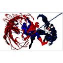
Lingling's project 1 roughs
-
d3ft0n3s23
- Posts: 17
- Joined: Thu Jan 29, 2015 6:28 pm
Re: Lingling's project 1 roughs
Love your logo! The background is very nice as well. You could probably make the point size of the type a little bigger. And I would stay away from using quotes and signatures in relation to what your services are. The customer should be able to understand what you offer from the services page all by itself. Quotes seem cheesy. Other than that great job!
- Adam Perez
-
TsukiMizuDCC

- Posts: 52
- Joined: Thu Jan 29, 2015 6:30 pm
Re: Lingling's project 1 roughs
REALLY AMAZING WORK, LINGLING!
Love the overall layout and type. There is a little too much white throughout the design. But all in all, very nice job. Can't wait to see more of what you come up with.
Love the overall layout and type. There is a little too much white throughout the design. But all in all, very nice job. Can't wait to see more of what you come up with.
Dalanie "TsukiMizu" Chester
Cosplayer/Artist/Daydreamer
"All work and no play makes the imagination a dull reality."
-Dalanie Chester
Cosplayer/Artist/Daydreamer
"All work and no play makes the imagination a dull reality."
-Dalanie Chester
Re: Lingling's project 1 roughs
I like the concept you are going with. You might wanna stay away from the white type. Also if you are selling something you might want to use less words. With something catchy.

Re: Lingling's project 1 roughs
Hi LingLing! Girl you truly have a unique web, artistic, & graphic design talent, all in one! I love everything about this design, as always! You are an inspiration to me and you could easily sell your skills ...OK where do I start...the background is gorgeous, the navigation is easy to spot right off the bat, the layout is spaced out and well balanced, the quote at the bottom is a nice touch, & your products page turned out good, & your logo is a perfect fit, as well. I have couple suggestion for you...one your logo is awesome and I think you should make it your vocal point...I would make it larger and the second thing is to stretch your navigation to fit the nav bar. Otherwise, nice job and I cannot wait to see your final design.
Danielle Record
"You Can't Use Up Creativity...the More You Use, the More You Have" ~Maya Angelou
"You Can't Use Up Creativity...the More You Use, the More You Have" ~Maya Angelou
-
c.j.jackson775

- Posts: 48
- Joined: Thu Jan 29, 2015 6:26 pm
- Contact:
Re: Lingling's project 1 roughs
I think these look very nice and elegant. Your style for sure. the logo is a tad small so make that a tad bigger.
Design may be king, but typography is the crown.
Re: Lingling's project 1 roughs
I like your design!
The logo is great! I know you like digital art, so you can emphasize that more.
Maybe, you can put more lines on the background.
Good job!
Kiwako
The logo is great! I know you like digital art, so you can emphasize that more.
Maybe, you can put more lines on the background.
Good job!
Kiwako
-
ravennvrmre
- Posts: 23
- Joined: Mon Aug 29, 2016 6:42 pm
Re: Lingling's project 1 roughs
I really like your colors. I would make the logo a lot bigger, right now it gets a big lost. I would also move the logo into the center of your navigation so it's one of the first things people notice. It's a great, memorable logo show it off.
Vicki Miller
-
stalksyouatnight

- Posts: 16
- Joined: Mon Aug 29, 2016 6:44 pm
Re: Lingling's project 1 roughs
I like your color scheme, and your layout works well, your logo just floats, but it's your site so your choice.
My irl name is Zackary Hughes...
-
ravens.way
- Posts: 22
- Joined: Sun Sep 04, 2016 6:30 pm
Re: Lingling's project 1 roughs
I like the colors used on your site. Increasing the transparency of the text box would make it blend more with the overall view of the site. I am not sure about the color in the navigation bar.