
My first set is designed to mimic a comic book cover. For my second design I wanted to focus on the panels that comics typically use, and I decided to have his artwork break the borders for emphasis.
Project 3 Preliminary Critique - Rebecca Baumann
Project 3 Preliminary Critique - Rebecca Baumann
The artist I've chosen is Art Spiegelman. He's a cartoonist who lives in NYC, and he's best known for writing the graphic novel memoirs MAUS, which is about his father's Holocaust experience. Spiegelman's work has a lot of energy, and he doesn't stick to just one graphic style. And yes, he's the asshole who created The Garbage Pail Kids. I forgive him for that one indiscretion.
My first set is designed to mimic a comic book cover. For my second design I wanted to focus on the panels that comics typically use, and I decided to have his artwork break the borders for emphasis.
My first set is designed to mimic a comic book cover. For my second design I wanted to focus on the panels that comics typically use, and I decided to have his artwork break the borders for emphasis.
-
UnKool Moe Dee

- Posts: 20
- Joined: Sat Aug 31, 2013 1:47 pm
Re: Project 3 Preliminary Critique - Rebecca Baumann
Rebecca,
Both of your layouts are well designed and easy to navigate. I prefer the second layout because I think the comic book layout goes really well with the imagery and I think the use of typography is really clever. Good work.
Aharon
Both of your layouts are well designed and easy to navigate. I prefer the second layout because I think the comic book layout goes really well with the imagery and I think the use of typography is really clever. Good work.
Aharon
"God is dead"
Nietzsche,1883
"Nietzsche is dead"
God, 1900
Nietzsche,1883
"Nietzsche is dead"
God, 1900

Re: Project 3 Preliminary Critique - Rebecca Baumann
Both designs are great. Very colorful and comic stylized. Nothing to add here, very professional
Re: Project 3 Preliminary Critique - Rebecca Baumann
Hi Rebecca,
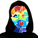
the breakdowns_home is super cool, I love how the character breaks through the panels. I also really like the
vertical nav bar and the comic book background. the mobile gallery is perfect for smart phones, big buttons that
promise lots of cool imagery. I should read Maus again, it's been decades.
p.s. I was too late to compliment your final project #2, but I wanted to say that your copy blew me away. to write
that much and stay consistent in voice and humor is amazing to me. I try for that but always end up just going for
the absurd when I get stuck
-
donnalouwho

- Posts: 30
- Joined: Thu Aug 29, 2013 6:15 am
Re: Project 3 Preliminary Critique - Rebecca Baumann
breakdowns! love it! the concept is interesting, fun, eye catching and amazing, as usual. 
Donna Harn
-
brianfreemantmcc
- Posts: 18
- Joined: Wed Aug 28, 2013 6:13 pm
Re: Project 3 Preliminary Critique - Rebecca Baumann
I like layout 1, it is bold and clear. Nice design!