project 3 roughs-mark pederson

Post links to your Project Three websites and preliminary work for discussion and feedback.
Locked
markp
Posts: 24
Joined: Sat Aug 31, 2013 1:49 pm

project 3 roughs-mark pederson

Post by markp »

I decided to combine this project with some real world experience.
By making a website for my friend Kurt's art, I was able to get a taste of working with a real client.
It is also nice that he can custom draw any elements that I request.

the first design is a haunted house theme because his art is playfully horror themed
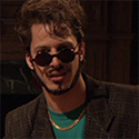
I lit everything from the bottom to get that cheesy flashlight under the face effect
he is currently drawing a custom name header to replace the plain text

I am leaning towards the second design because it makes better use of his art in the design elements
monitor_home.jpg
ipad_home.jpg
monitor_gallery.jpg
ipad_gallery.jpg
monitor_home_two.jpg
iphone_home_two.jpg
monitor_gallery_two.jpg
iphone_gallery_two.jpg

User avatar
re8ecca
Posts: 19
Joined: Fri Aug 30, 2013 1:36 pm

Re: project 3 roughs-mark pederson

Post by re8ecca »

Hi Mark - Yeah, I agree with you, the second set with the navy background is working better for me. I like how you've incorporated the artist's work into the background as well as the foreground. I especially like your entry page, that's a nice touch.
Rebecca Baumann
rebecca.dsb@gmail.com

User avatar
UnKool Moe Dee
Posts: 20
Joined: Sat Aug 31, 2013 1:47 pm

Re: project 3 roughs-mark pederson

Post by UnKool Moe Dee »

Mark,

I like the second set with the navy background. I would work on using different sizes for your elements to create some emphasis on your pages. Very nice start.

Aharon
"God is dead"
Nietzsche,1883

"Nietzsche is dead"
God, 1900

User avatar
Alexey
Posts: 23
Joined: Wed Aug 28, 2013 8:19 pm

Re: project 3 roughs-mark pederson

Post by Alexey »

Second design I like better. Very nicely done stylistics in navigation and logo!

User avatar
donnalouwho
Posts: 30
Joined: Thu Aug 29, 2013 6:15 am

Re: project 3 roughs-mark pederson

Post by donnalouwho »

second design for me. i like the color scheme, the layout, it awesome with the artists work. very reflective. good job. :)
Donna Harn

brianfreemantmcc
Posts: 18
Joined: Wed Aug 28, 2013 6:13 pm

Re: project 3 roughs-mark pederson

Post by brianfreemantmcc »

I love the second layouts. They are clean and easy to see. Nice!

Locked