
project one critique
Re: project one critique
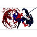
I really enjoy the head of the dragon. The first on is done the best.

Re: project one critique
Hi Ashley! Great job on both of your designs and what a great idea for a business(unique and creative)! Your first design is awesome so I am going to go with it. I think your layout is easy to navigate through, your logo is eye catching/grabs your attention right away, you know right away what your site is about, your color scheme is perfect, & I think you typography goes well together. One thing that I would suggest is to add contact info and/or social media to the home page other than that good job and I cannot wait to see your final design! 
Danielle Record
"You Can't Use Up Creativity...the More You Use, the More You Have" ~Maya Angelou
"You Can't Use Up Creativity...the More You Use, the More You Have" ~Maya Angelou
Re: project one critique
i like the first one. the dragons head is really neat. it would draw me in . i would like to see a nav bar where your pages are going to go. its very clean and simple.
-
d3ft0n3s23
- Posts: 17
- Joined: Thu Jan 29, 2015 6:28 pm
Re: project one critique
Both are great but the serious one is by far the coolest. Great job on the logo, the type goes well with it.
I get that you are going for a simplistic and clean look, but there seems to be something missing. I can’t tell you what it is because I know you don’t want to distract from the artistry of the eggs by themselves. Maybe try some simple, yet interesting, very light grey design work in the empty areas on the side of the content area.
Very, very cool!
- Adam Perez
-
c.j.jackson775

- Posts: 48
- Joined: Thu Jan 29, 2015 6:26 pm
- Contact:
Re: project one critique
I'm enjoying the bottoms designs. There is a little bit more going on and its more interesting to me. That red might want to be muted it's a little loud. I't may come to grow on me though depending on the other elements you add.
Design may be king, but typography is the crown.
-
ashleighporterfield

- Posts: 22
- Joined: Thu Jan 29, 2015 6:26 pm
Re: project one critique
What an awesome concept! I love dragons! They are definitely the rage right now. I really like your top design. I think your first one is a lot stronger but I do think you could invert it to really make it more awesome. Awesome work so far!
Ashleigh Porterfield
Re: project one critique
I like your rough2.
The logo is cool, and the design is very clean, but I think it too simple.
Using different background color or texture may help it.
Good job! I really like the concept!
Kiwako
The logo is cool, and the design is very clean, but I think it too simple.
Using different background color or texture may help it.
Good job! I really like the concept!
Kiwako
-
ravennvrmre
- Posts: 23
- Joined: Mon Aug 29, 2016 6:42 pm
Re: project one critique
I really like both of your designs and the idea. Who wouldn't want a pet dragon, the adopt me dragon is so cool and adorable. As far as which one to go with, it just depends on the feel you want to go for. The top design is very clean and a little more serious with a more menacing dragon, while the bottom ones a tad more playful with the speech bubble and the less menacing dragon. Awesome work.
Vicki Miller
-
stalksyouatnight

- Posts: 16
- Joined: Mon Aug 29, 2016 6:44 pm
Re: project one critique
It seems you know what direction you are going. It's clean which looks nice, and professional, looks good idk what to say to improve it.
My irl name is Zackary Hughes...
-
ravens.way
- Posts: 22
- Joined: Sun Sep 04, 2016 6:30 pm
Re: project one critique
I like both sites. Rough 1 has a clean look but the navigation is hard to see. Rough 2 has a nice use of colors and a playful look. The navigation is easy to see. The black banner is a nice touch.